
Why UI/UX Design Matters More Than Just Making an Application Look Good
Good UI/UX design is about making digital products easier to understand, easier to use and better aligned with real user workflows.
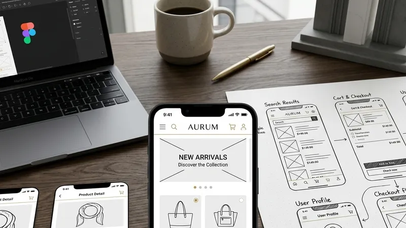
A visually attractive application can still be difficult to use. Good UI/UX design is not simply about colours, typography and attractive screens. It is about understanding users, organising information and creating a clear path from one action to the next.
1. UI and UX Are Not the Same Thing
UI, or User Interface, focuses on the visual and interactive elements of a digital product.
UX, or User Experience, focuses on how the complete product feels and works from the user's perspective.
- UI: Colours, typography, spacing, buttons, components and visual hierarchy.
- UX: User journeys, workflows, information architecture and ease of completing tasks.
A strong product needs both.
2. Start With the User Journey
Before designing individual screens, it is important to understand what the user is trying to accomplish.
For example, an ecommerce customer may need to discover a product, review its information, add it to a cart and complete checkout.
The design should support that journey instead of treating every screen as an isolated page.
Design the complete journey first, then design the individual screens that support it.
3. Information Architecture Makes Products Easier to Understand
Users should be able to understand where they are and where they can go next.
Clear navigation, meaningful categories and logical information grouping reduce the mental effort required to use an application.
- Group related information together.
- Use familiar navigation patterns.
- Keep important actions easy to find.
- Avoid unnecessary levels of navigation.
4. Visual Hierarchy Guides Attention
Not every piece of information on a screen has the same importance.
Typography, spacing, size, contrast and positioning can help users understand what deserves their attention first.
A strong visual hierarchy makes a complex interface feel simpler without removing important information.
5. Consistency Builds Confidence
When buttons, forms, headings and other components behave consistently, users do not need to learn a new interaction on every screen.
A design system can help maintain consistency across the application.
Reusable components allow teams to maintain a consistent visual language while reducing unnecessary design and development duplication.
6. Mobile Design Needs Special Attention
A desktop interface cannot simply be reduced in size and called a mobile experience.
Mobile users interact with smaller screens, touch controls and different usage environments.
- Use touch-friendly controls.
- Keep important actions accessible.
- Reduce unnecessary form fields.
- Design readable typography.
- Consider one-handed usage where appropriate.
7. Forms Should Not Feel Like Work
Forms are common in business applications, ecommerce platforms and service websites.
A poorly designed form can make users abandon a process even when the underlying feature works perfectly.
Good form design includes clear labels, logical grouping, useful validation and understandable error messages.
8. Empty States and Error States Matter
Designers often focus on the ideal situation where everything works correctly. Real applications also need to handle empty results, failed requests, invalid information and unavailable services.
A useful empty or error state should tell the user what happened and, when possible, what they can do next.
An error message should help the user recover from the problem instead of simply telling them that something went wrong.
9. Performance Is Part of User Experience
UX is not limited to visual design.
If a page takes too long to load, an interaction feels delayed or an application repeatedly shows loading states, the user experience is affected even when the interface looks excellent.
Performance should therefore be considered as part of the overall product experience.
10. Accessibility Should Be Considered From the Start
Digital products should be designed so that as many people as reasonably possible can use them.
- Maintain appropriate colour contrast.
- Use meaningful labels.
- Support keyboard navigation where applicable.
- Provide useful alternative text for important images.
- Do not rely only on colour to communicate important information.
11. Prototype Before Building Everything
Interactive prototypes can help teams understand how a product will work before significant development effort is spent.
They can reveal confusing navigation, missing states and workflow problems early in the project.
Fixing a UX problem during design is usually easier than discovering the same problem after development is complete.
12. Design Should Support the Business
A beautiful interface is not enough if it does not support the business objective.
An ecommerce application should make purchasing easier. A CRM should make customer management easier. An employee application should make daily workplace actions easier.
The design should connect user needs with business goals.
Good design is not decoration. It is a way of making the product easier to understand and use.
Nikiphoros
Conclusion
UI/UX design plays an important role in the success of a digital product because it determines how users understand and interact with the system.
At Nikiphoros, we believe design should begin with the user journey and business workflow, then translate those requirements into a clear, consistent and visually strong interface.